" width="22.000083041373966px"><path d="M 0 22 L 0 0 L 22 0 L 22 22 Z" fill="transparent" height="22px" id="rJQlHEwpP" width="22px"/><path d="M 0 0 L 0 4.252 C 0 4.549 0.191 4.812 0.473 4.905 C 0.544 4.928 0.616 4.939 0.688 4.939 C 0.902 4.939 1.109 4.838 1.241 4.659 L 3.728 1.274 Z" fill="rgb(255, 255, 255)" height="4.938932307692308px" id="YarZzCSSw" transform="translate(8.021 16.145)" width="3.728086153846137px"/><path d="M 21.711 0.127 C 21.5 -0.022 21.224 -0.042 20.994 0.078 L 0.369 10.849 C 0.126 10.976 -0.018 11.237 0.002 11.511 C 0.023 11.786 0.205 12.02 0.465 12.109 L 6.199 14.069 L 18.409 3.628 L 8.96 15.012 L 18.57 18.297 C 18.641 18.321 18.717 18.333 18.792 18.333 C 18.916 18.333 19.04 18.299 19.149 18.233 C 19.323 18.127 19.442 17.948 19.472 17.748 L 21.993 0.789 C 22.03 0.533 21.922 0.278 21.711 0.127 Z" fill="rgb(255, 255, 255)" height="18.333446153846154px" id="aWDDnRa5x" width="22.000083041373966px"/></g></svg>)
" height="12.034px" id="Af5cA1UWb" transform="translate(8.426 6.766)" width="11.37395111111111px"/><path d="M 0 0 L 3.652 0 L 3.652 11.748 L 0 11.748 Z" fill="rgb(255, 255, 255)" height="11.748012222222219px" id="MkLJJz3Dq" transform="translate(2.486 7.052)" width="3.6519999999999997px"/><path d="M 2.112 0 C 0.946 0 0 0.946 0 2.112 C 0 3.278 0.946 4.246 2.112 4.246 C 3.278 4.246 4.224 3.278 4.224 2.112 C 4.224 0.946 3.278 0 2.112 0 Z" fill="rgb(255, 255, 255)" height="4.2459999999999996px" id="aV_Qrj4vj" transform="translate(2.2 1.2)" width="4.223999999999987px"/></svg>)
" width="22.000019700488746px"><path d="M 0 22 L 0 0 L 22 0 L 22 22 Z" fill="transparent" height="22px" id="TAln88NdR" width="22px"/><path d="M 9.051 6.216 C 9.508 5.986 9.853 5.73 10.089 5.454 C 10.51 4.956 10.718 4.296 10.718 3.478 C 10.718 2.681 10.51 2.001 10.095 1.43 C 9.402 0.501 8.229 0.025 6.57 0 L 0 0 L 0 13.411 L 6.126 13.411 C 6.816 13.411 7.456 13.352 8.047 13.231 C 8.638 13.109 9.15 12.885 9.583 12.558 C 9.968 12.273 10.29 11.919 10.546 11.503 C 10.95 10.873 11.152 10.159 11.152 9.365 C 11.152 8.594 10.975 7.939 10.623 7.399 C 10.267 6.86 9.744 6.466 9.051 6.216 Z M 2.71 2.329 L 5.67 2.329 C 6.32 2.329 6.856 2.4 7.277 2.538 C 7.764 2.741 8.007 3.152 8.007 3.779 C 8.007 4.341 7.822 4.735 7.454 4.956 C 7.085 5.177 6.605 5.289 6.016 5.289 L 2.71 5.289 Z M 7.39 10.848 C 7.063 11.006 6.602 11.085 6.012 11.085 L 2.71 11.085 L 2.71 7.508 L 6.057 7.508 C 6.64 7.512 7.094 7.589 7.419 7.734 C 7.996 7.995 8.284 8.473 8.284 9.173 C 8.284 9.998 7.987 10.554 7.39 10.848 Z" fill="rgb(255, 255, 255)" height="13.411432202354009px" id="HFm9zyYtR" transform="translate(0 4.124)" width="11.152166666666682px"/><path d="M 5.826 0 L 0 0 L 0 1.669 L 5.826 1.669 Z" fill="rgb(255, 255, 255)" height="1.669384444444444px" id="ob69wwipo" transform="translate(14.059 4.75)" width="5.826333333333329px"/><path d="M 9.883 3.982 C 9.762 3.205 9.495 2.522 9.08 1.932 C 8.625 1.264 8.047 0.774 7.344 0.465 C 6.645 0.154 5.857 -0.001 4.979 0 C 3.507 0 2.31 0.461 1.385 1.375 C 0.462 2.292 0 3.611 0 5.33 C 0 7.163 0.51 8.487 1.536 9.3 C 2.558 10.114 3.738 10.52 5.077 10.52 C 6.698 10.52 7.959 10.037 8.86 9.074 C 9.436 8.467 9.762 7.868 9.833 7.281 L 7.149 7.281 C 6.994 7.571 6.814 7.798 6.607 7.963 C 6.233 8.266 5.747 8.417 5.15 8.417 C 4.582 8.417 4.101 8.292 3.699 8.043 C 3.036 7.644 2.69 6.946 2.646 5.952 L 9.971 5.952 C 9.982 5.095 9.954 4.436 9.883 3.982 Z M 2.712 4.239 C 2.808 3.595 3.042 3.083 3.413 2.705 C 3.784 2.328 4.31 2.138 4.982 2.137 C 5.602 2.137 6.121 2.314 6.543 2.67 C 6.959 3.029 7.195 3.551 7.243 4.239 Z" fill="rgb(255, 255, 255)" height="10.519602312513724px" id="OpqIGSaT2" transform="translate(12.027 7.356)" width="9.973242433032693px"/></g></svg>)
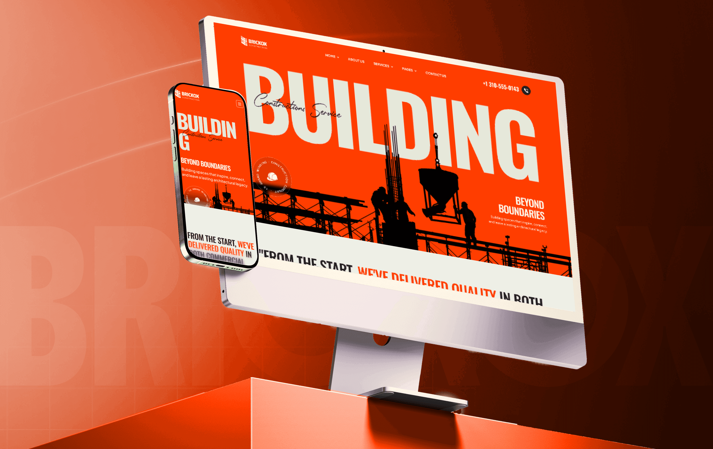
Brickox
Live Preview
" height="19.158754509607306px" id="lkdX1iRtD" transform="translate(0 0)" width="21.774071716018568px"/></svg>)

Website Design
Industry:
Branding
Design System
Year:
2025


Synox is a modern payment platform for businesses and merchants. It enables secure payments, automated transactions, subscription management, and seamless checkout through one platform.
The challenge was to showcase a powerful payment solution that resonates with both business owners seeking growth and developers requiring secure, scalable integrations creating an experience that feels intuitive, reliable, and tailored to each audience.
I spent time understanding where the current experience fell short. I identified 4 core problems clusters that were silently hurting conversions and trust.

Each problem got a specific, deliberate answer not just a redesign pass, but a change in what the page was actually doing.

Typography
Title
Body Text
inter
Color System

A payment platform that clearly communicates its value, guides businesses and developers through tailored experiences, builds trust with clear messaging and meaningful insights, and creates a seamless journey where every section from the hero and features to pricing and footer is unified within one cohesive design system.

Testimonials



Trusted By




Get in touch
Tell me about your business and what's not working I'll tell you if and how I can help.
I reply within 24 hours. If your project is urgent, use the Book a Call button to find a time directly.
Schedule a call on cal.com
Book a Call
FIll this form below

Life behind the desk